Banking app (concept)
Concept for a banking app centred around giving greater identity to those you share your funds with.
Mission: Create a clean, fluid UI/UX flow for a banking app that puts an emphasis on sharing funds with friends. Must be both visually appealing and highly functional.
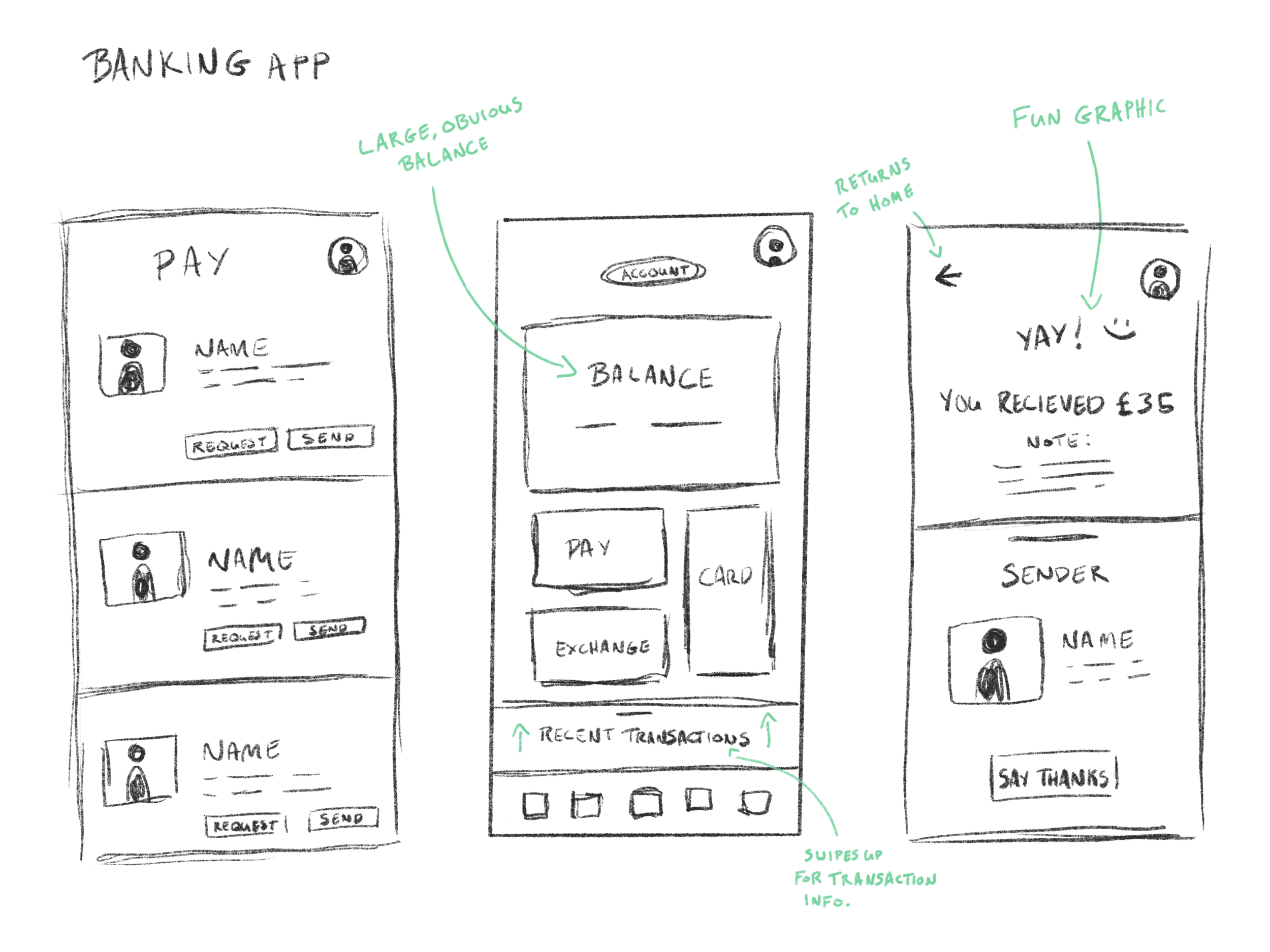
Initial sketch: For a banking app, I wanted to focus on ease of use. Having a large bank balance view was my first goal. That became the centre-piece of the design and the jumping off point for everything else.
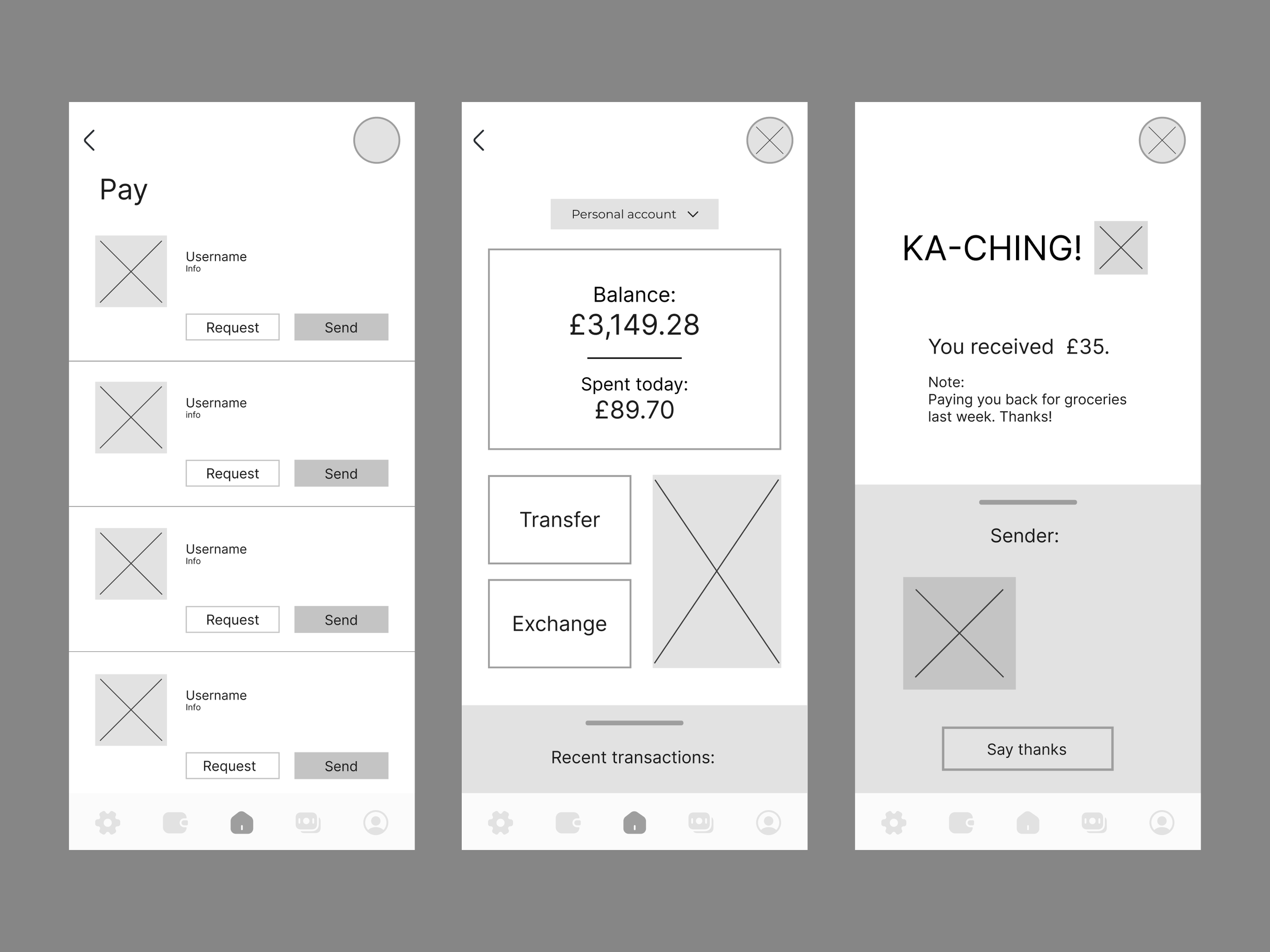
Wire-framing: Building out how I want the design to look in more detail. Added in some icons for the menu.
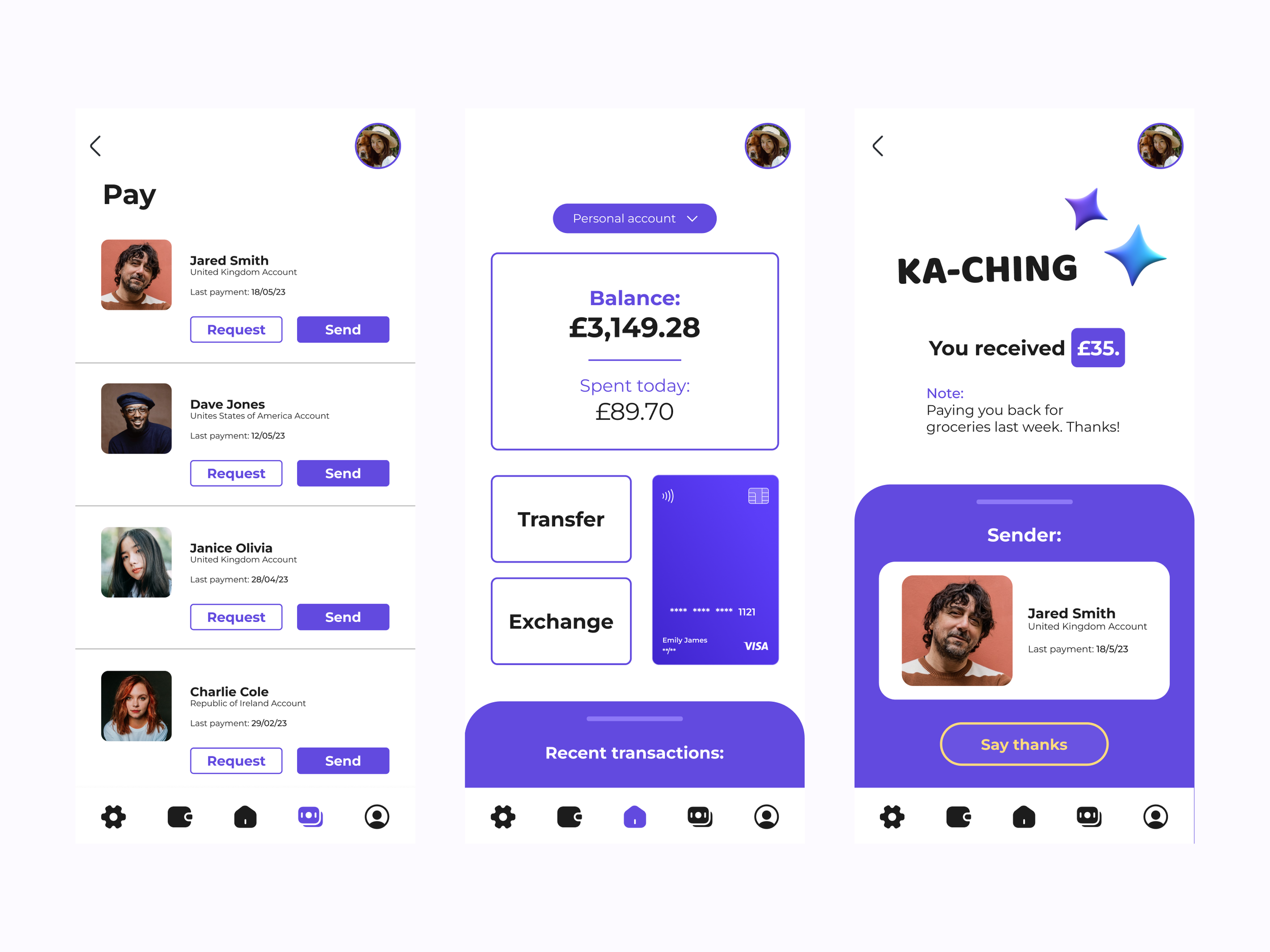
High-fidelity build: Brought in colours, faces, some graphics. Went for a rounded-corners design. Overall, it's in the right direction but something about it wasn't quite exciting me... So then I started over!
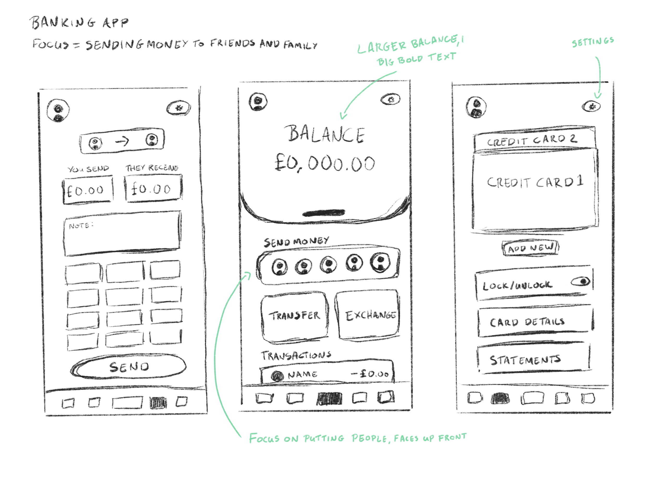
Initial sketch (2): This time around I went bigger and bolder on the balance view, giving it a larger section and allowing it to be the eye-catcher. I've shifted to putting nearly all of the focus on sending money between friends and family.
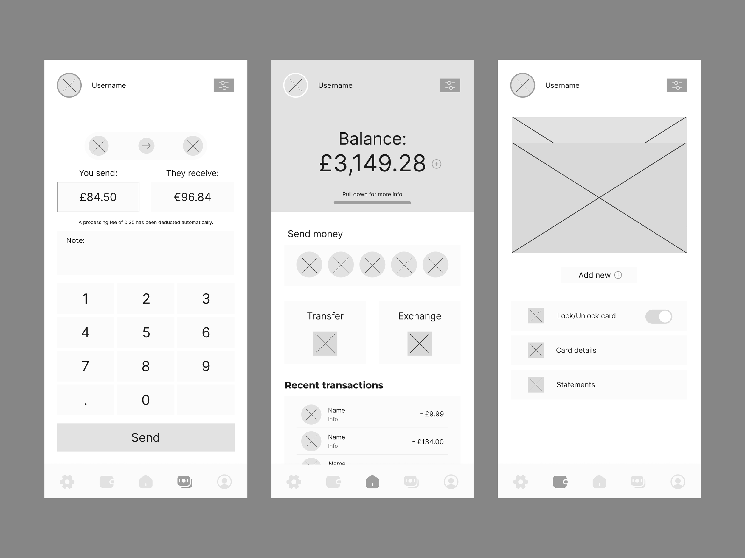
Wire-framing (2): Building out my sections in more detail before committing to a full design. Through this process I found extra space for transactions and the keypad. Nice!
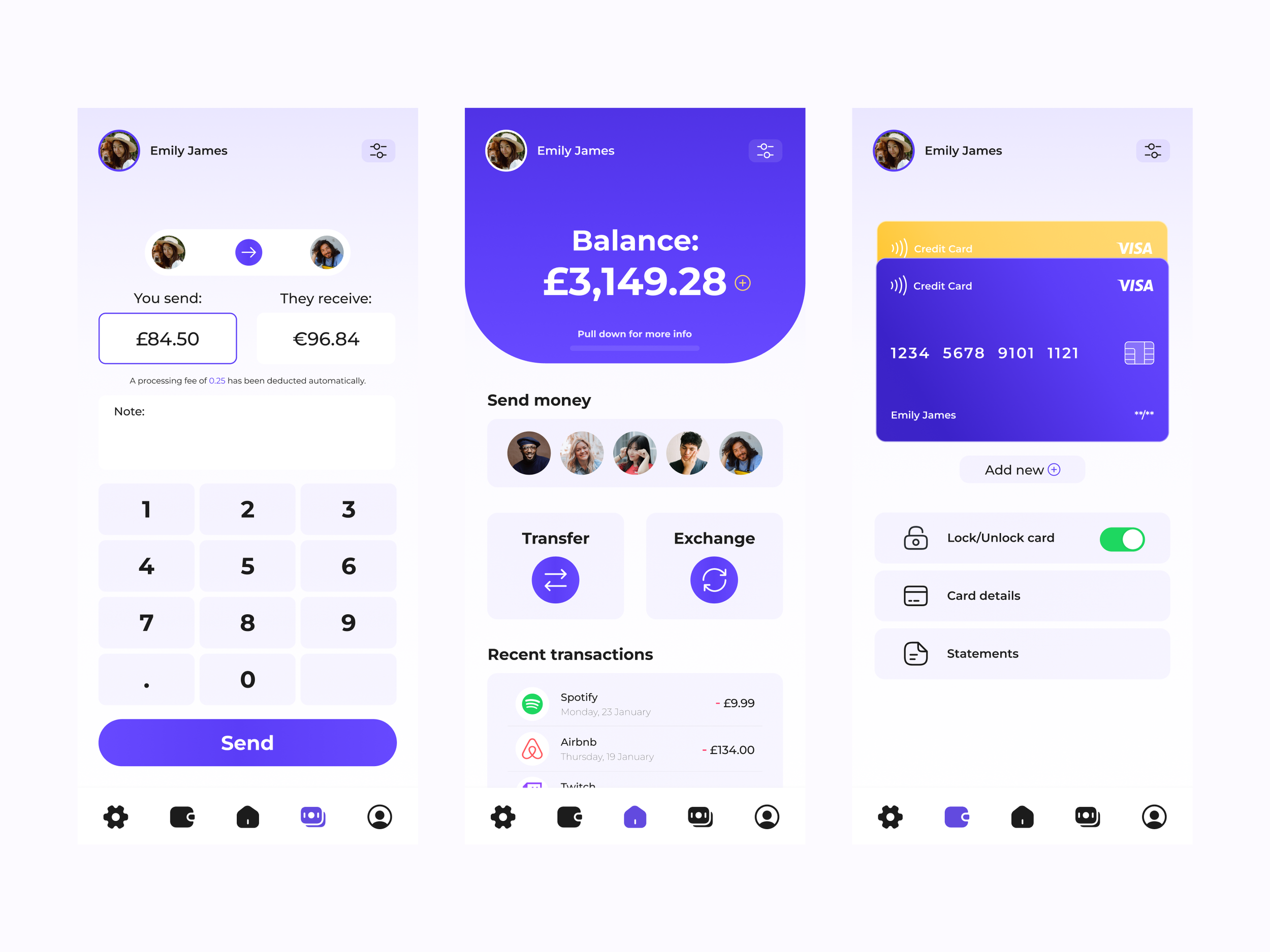
High-fidelity build (final!): Added in colours and design elements as before, this time bringing in gradients to give it more of a modern feel, whilst retaining a focus on the pivotal aspects.
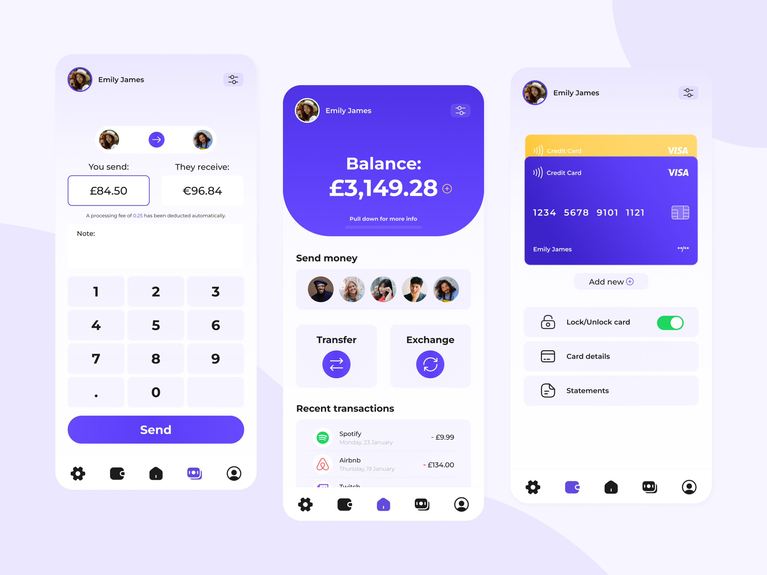
Final shot for good measure
Initial sketch: I wanted to design a banking app with a focus on ease of use. Having a large bank balance view was my first goal. That became the centre-piece of the design and the jumping off point for everything else.
Wire-framing: Building out how I want the design to look in more detail. Added in some icons for the menu.
High-fidelity build: Brought in colours, faces, some graphics. Went for a rounded-corners design. Overall, it's in the right direction but something about it wasn't quite exciting me... So then I started over!
Initial sketch (2): This time around I went bigger and bolder on the balance view, giving it a larger section and allowing it to be the eye-catcher. I've shifted to putting nearly all of the focus on sending money between friends and family.
Wire-framing (2): Building out my sections in more detail before committing to a full design. Through this process I found extra space for transactions and the keypad. Nice!
High-fidelity build (final!): Added in colours and design elements as before, this time bringing in gradients to give it more of a modern feel, whilst retaining a focus on the pivotal aspects.
Final shot for good measure